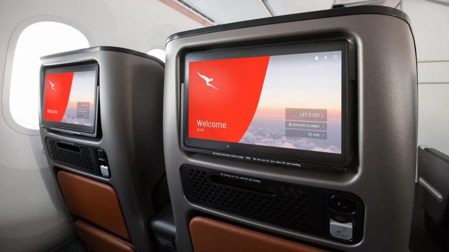
Qantas
Designing an award-winning in-flight entertainment system for Australia’s favourite airline.
Product Designer | 2019-2021
Introduction
In 2019, Qantas approached Massive Interactive to create an in-flight entertainment system (IFE) for their feet of A330’s. The aim of the project was to create an engaging, user-friendly, and entertaining experience for passengers while flying.
Project Overview
Qantas wanted to enhance the user experience for its passengers during their flights by designing an innovative IFE system that could provide a seamless entertainment experience. The system needed to cater to a diverse group of passengers with different preferences and needs, ranging from movies and news to music and games. Working alongside a mixed team of 4 designers, I was responsible for the end-to-end delivery of the project - working from research and discovery all the way through to UI designs and UX documentation.

User Research
The first step in the design process was to understand the needs and requirements of the business. We started with a kick-off session with the team at Qantas to hear their current insights into user behaviour, understand their vision for the project and raise any constraints or limitations, as well as share their brand guidelines for future visual design work.
After establishing the requirements and goals of the business, we set out to conduct user research to understand the needs and preferences of Qantas' passengers. We gathered insights through contextual observation - jumping on a flight from Sydney to Melbourne and interviews with Qantas' frequent flyers. We found that passengers wanted an IFE system that was easy to use, visually appealing, and provided a variety of entertainment options beyond just TV shows and Movies. Passengers were also looking for recommendations on what to watch or listen to as a lack of internet connection meant there was no way to find reviews.
Quote from passenger - “Usually, I’d just look up the movie on IMDB to see what the ratings are like”.
Furthermore, it was discovered that a majority of passengers like to explore and discover what’s on offer before jumping into consuming content. Lastly, a number of frequent flyers expressed their desire for an IFE that was personalised and remembered what content they liked or had already seen.
Quote from passenger - “Sometimes I don’t get to finish a movie. I plan to watch the rest of it on my flight home, but I often forget where I was up to.”
User Personas
Based on the research, we created a number of user personas to gain a deeper understanding of the needs of our users and build an empathetic relationship towards them.
An example of a persona we created is 'Jake.' Jake was a 35-year-old business traveller who flew frequently for work. He enjoyed watching movies, listening to music, and reading up on the latest news. He preferred an IFE system that was intuitive, had a broad selection of entertainment options, and allowed him to pick up where he left off if he didn’t get to finish a movie.
Another example of a persona we created is 'Sarah.' Sarah was a 58-year-old retired professional who was an avid traveller. She wanted an IFE that would take her mind off travelling and loved listening to and discovering new movies and podcasts.

Ideation
After synthesising the data from the user research phase (e.g. affinity mapping), clarifying requirements and highlighting the needs of the passenger, we started to sketch out lo-fi user flows and concepts, and potential features before moving onto revised wireframes. Before jumping into high-fidelity visual designs, we wanted to make sure the user flow and interaction model supported the user research findings. Furthermore, we were able to get alignment on the core user experience with the client without them getting caught up in minor visual design details.
The wireframes highlighted a feature-rich, intuitive and entertaining experience for the passenger. For example, the home screen showcased a broad range of content types, e.g. Movies, News, Podcasts, etc. Passengers could save media to their lists, discover popular content and pick up where they left off.

Visual design
Once we were happy with the state of the wireframes and user flows, we created a simple and visually appealing UI design with clear navigation, iconography and vibrant imagery to showcase the entertainment options available. The colour palette was in line with Qantas' brand guidelines, and the typography was easy to read and met AAA accessibility standards. Given the contextual use and environment of an IFE, we went with a dark UI to complement media consumption and reduce light pollution in the cabin.
Usability testing
To validate our design solutions, we created an interactive prototype that we could then test with passengers. Thankfully, Qantas was able to provide us with the same hardware used on the A330 so we could simulate a real-life experience. This testing proved to be extremely valuable and a number of insights and learnings were discovered.
The biggest lesson learned from the testing phase was around the limitations and touch sensitivity of the hardware. To this point, we had been designing on 4k monitors and retina display iPads. Touch targets were large enough, animations felt smooth and swipe interactions worked without issue on an iPad. However, this was not the case on these much older devices. We could see participants tapping buttons multiple times, struggling to swipe up the flight status drawer, and transitions didn’t look as smooth as they did on an iPad.
To combat these issues, we pulled back on swipe interactions and used taps instead. We increased touch targets and scaled back the animations. Although the UI didn’t look as fancy and shiny as it did in the previous iteration when we were designing in 4k, what we ended up with was an IFE that was simple and accessible to use, provided clear feedback to user response and provided engaging visuals to the passenger.
Conclusion
In conclusion, designing an in-flight entertainment system for Qantas required a deep understanding of the user's needs and preferences. We used user research and user personas to create a user-friendly, intuitive, and visually appealing IFE system for Qantas. The IFE system had a straightforward user flow, a variety of entertainment options with reviews, and most importantly provided an intuitive, easy-to-use experience that catered to all passengers. Furthermore, we responded to the learnings from the usability testing to create an interface that was personalised to the context and limitations of the hardware. With this IFE system, passengers like Jake can easily find and enjoy their favourite movies, music, and read up on the lastest news, making their flights more enjoyable and comfortable.